
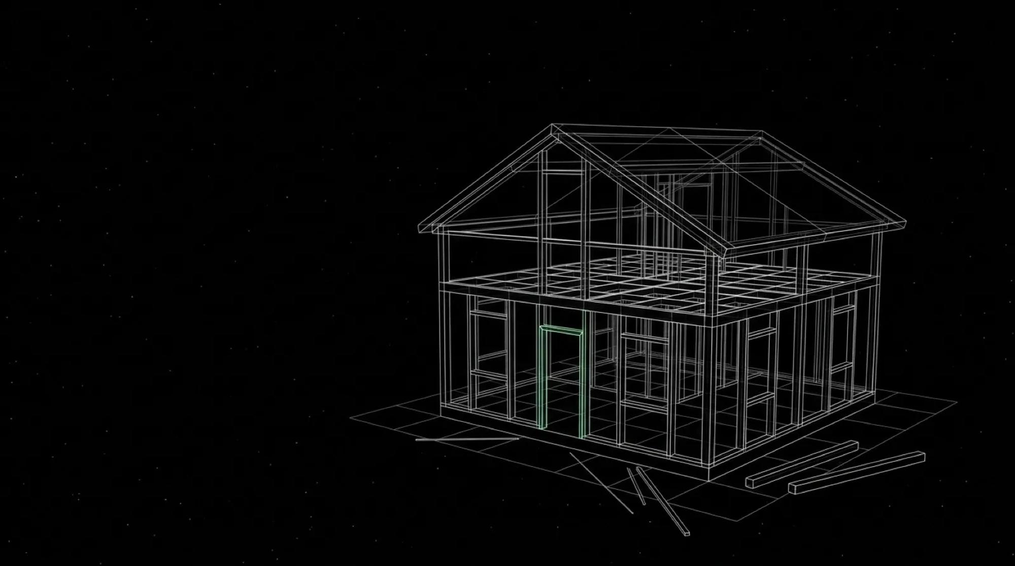
Someone has sent you a set of grey screens: rectangles with a cross where the images will go, lines where the text will be, no logo. The supplier calls it a wireframe and asks you to sign it off before moving on to mock-ups. The temptation is to skim it, on the basis that the real work starts once there are colours. Yet this is the cheapest moment you will get to fix a website or an app.
I designed Moonworkers, my payroll software for small UK businesses (it is in my portfolio of projects), by starting from its users: personas first, then wireframes, then a design system in Figma. What follows comes from that work and from a few client projects: what a wireframe is and how it differs from a mock-up, my method for making one that earns its place, a checklist for reviewing it, and the cases where I skip the step.
01A wireframe shows structure, not appearance
Nielsen Norman Group sums it up in a short video on the difference between wireframes and prototypes: a wireframe is a simplified representation of a site or app, made of lines and text. It shows which elements are there and which come first. Visual design and colour are left out, whether it is drawn by hand or in software.
In French it is called a maquette fil de fer or maquette fonctionnelle, and people say zoning when they only draw the main areas of a page. Figma, in its guide to wireframing, describes it as the skeleton of the interface: greyscale, boxes in place of images, and a plan that helps the team agree on requirements.
What I ask of a wireframe comes down to a few questions. What is on this screen? In what order does the eye meet it? What can the person do here, and where do they go next? If the document answers those clearly, it has done its job, even if it is ugly.
02Wireframe, mock-up, prototype: three steps, three questions
The three words are often used interchangeably, and a lot of muddled meetings start there. I tell them apart by the question each one answers:
- the wireframe answers "what and where": the content of each screen, its hierarchy, the paths from one screen to another;
- the mock-up answers "what does it look like": colours, typefaces, images, branding, on static screens;
- the prototype answers "does it work when you use it": you click, move between screens and watch what happens.
The line is not watertight. In the same video, Nielsen Norman Group points out that every wireframe is a low-fidelity prototype, but not every prototype is a wireframe. I went into the next stage in my piece on building a clickable prototype before development.
Why not jump straight to the mock-up? Because the cost of a change rises at every step. Nielsen Norman Group puts it plainly in its article on prototype fidelity: ripping up code is very expensive, ripping up a prototype much less so, especially if it is a sheet of paper. The same article notes something I have often seen in meetings. Faced with a polished design, a decision-maker is tempted to say "this looks good, let's make it go live". Faced with a sketch, everyone still expects changes.
03Making a useful wireframe in five steps
This is the method I follow, whether the wireframe is drawn on paper or in Figma.
1. Start from the people and what they come to do
Before drawing a single rectangle, I write down for each screen who arrives there and what they want to get done. On Moonworkers, the wireframes came after the personas, and that order makes sense: you cannot judge a screen that has nobody in mind. If you do not have personas yet, I explain how to build ones that help you decide.
2. List the screens and the paths
First a list of screens, then arrows between them. For a website: the home page, a service page, an article, the contact page. For an app: sign-up, the dashboard, the main task. The paths matter as much as the screens, because a journey often breaks between two pages.
3. Write with the real content
Placeholder text hides problems. A real fifteen-word heading will not fit in the space drawn for four, and a menu numbered 1 to 4 tells you nothing about how the content is organised. Figma's guide gives the same rule: as soon as you are organising information, use real content rather than lorem ipsum. At the very least I put in the real headings, the real buttons and the real form labels.
4. Stay in grey, and draw several options
No colour, one typeface, boxes for images. And rather than one proposal, two or three. For parallel design, Nielsen Norman Group recommends creating at least three alternatives and at most five, on a few key pages, refined only to the level of rough wireframes, then combining the strongest ideas from each. On client projects, I have seen a decision come unstuck once several directions were shown at the same level of finish. Nobody can then prefer an option just because it is better dressed.
5. Annotate what cannot be seen
A static wireframe does not say what happens on a click, when a field is filled in wrongly or when a list is empty. I add notes in the margin: display rules, error messages, content that comes from another system. Those notes then feed into the website specification and stop the developer from having to guess.
04Reviewing a wireframe without talking about colours
If you are the one signing it off, this is where you have the most to gain. A wireframe is reviewed against a checklist, not on gut feeling. Here is the one I use:
- on each screen, I can find what the person comes to do, and the main action is visible without hunting for it;
- the order of the blocks follows the order of the visitor's questions;
- every button leads somewhere, and I know where;
- the awkward cases are covered: empty list, error, loading, access denied;
- nothing is there only because other sites do it.
The most common trap is commenting on the look: "this grey is dull", "the logo should be bigger". Figma's guide gives advice I follow: if reviewers dwell on aesthetic details rather than on users' needs, lower the fidelity of the wireframe and strip out anything too polished until you get the feedback you need. I prefer to say it before the meeting: today we are not discussing colours or fonts, only what is on the page and in what order.
On this blog, I do the same thing with text. Every article follows a structure written before drafting (a short introduction, subheadings, a practical section, an FAQ, the sources), and a tool checks that the article respects it before it is published. It is a wireframe made of words: the order and place of each block are decided before the style, and the review looks at structure first.
05When to skip the wireframe
The wireframe is not a ritual. There are cases where I do without it, or nearly.
When a design system already exists and the screen resembles what has been built before, drawing in grey and then redrawing everything in colour wastes time. Figma's guide acknowledges it: in that case, exploring straight away in high fidelity can be just as quick and just as effective. That is one of the benefits of a well-maintained design system.
When you need to test real behaviour with users, a wireframe is not enough. The UK government's Service Manual, in its page on making prototypes, separates the two uses: sketches are for exploring and discussing ideas with colleagues, code prototypes are more realistic for user research. It also reminds you not to copy prototype code straight into production.
And when the page is simple and familiar, such as a legal notice or a contact form, a five-minute sketch on paper is enough. What matters is that someone has decided the structure before dressing it.
The wireframe has its limits too. It tells you nothing about real readability, tone, or how a screen feels under your thumb. And a team can approve a wireframe without having understood it, simply because there was nothing eye-catching to argue about. That is why I have each screen talked through out loud rather than waiting for an "ok" by message.
06Where to start this week
If you have a website or an app in the works, take the most important screen, the one where sign-up, the contact request or the purchase happens. Draw it in grey, with the real text, on paper or in Figma. Make two versions. Show them to two people who do not know the project, and ask them what they would do first.
You will soon know whether the structure holds. If you would like support with this stage, from wireframe to design system, it is part of what I do on projects, and we can talk about it.